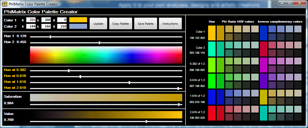
PhiMatrix includes a color palette generator which can be used to generate rich, appealing color schemes. The entire PhiMatrix color palette is based on golden ratio (Phi) relationships of the hues of two colors, shown as Color 1 and Color 2
.
Selecting the Palette Generator colors
You can select Color 1 and Color 2 in two ways:
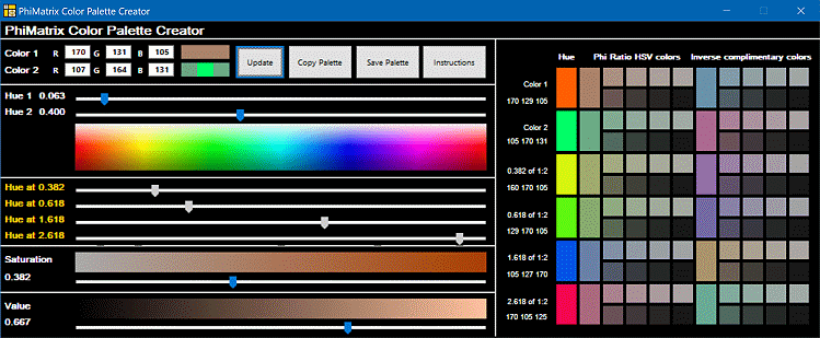
 1) MOVE THE SLIDERS – Move the sliders for Hue 1 and Hue 2 and then adjust the sliders for Saturation and Value (Luminosity) levels to set Color 1 and Color 2 in the color palette. Note that as you move the Hue 1 and Hue 2 sliders that four other hues are calculated based on various golden ratio proportions (0.382, 0.618, 1.618 and 2.618) that are applied to the distance in the spectrum between Hue 1 and Hue 2.
2) ENTER RGB VALUES AND CLICK UPDATE – Enter the RGB values for Color 1 and Color 2. Click on the Update button to automatically adjust all the sliders below to the colors represented by the RGB values of Color 1 and Color 2. If you create Color 2 this way Color 2 in the Color Palette is adjusted to match the Saturation and Hue of Color 1 for consistency and aesthetics of appearance. Up to three colors may appear in the color swatch to the right of Color 2. The left color is based on the RGB values entered for Color 2. The middle color is the pure Hue of Color 2. The right color is Color 2 adjusted to match the Saturation and Value of Color 1.
Other Color Palette Generator
CHANGE GRID COLOR / DISPLAY RGB VALUES – Click on any color on the palette to display its RGB color values and change the PhiMatrix grid to that color. Colors displayed horizontally in the color palette are determined by applying golden ratio relationships to the Hue and Saturation.
COPY PALETTE TO CLIPBOARD – Copy the color palette to the clipboard for pasting into other programs by clicking on the Copy Palette button. In most photo editing programs you can then sample the colors in the palette for application into your image. See above example.
SAVE PALETTE TO DISK – Save the color palette to an image file (jpg, png, gif, bmp or pict) by clicking on the Save Palette button. You can then open the image in other programs. See above example.
Thanks go to Michael Semprevivo for his original program PhiBar which introduced the basic concept used in the PhiMatrix Color Palette Generator.
Color Palette Selection Example
Here’s a real life example of how the Color Palette Generator might be used.
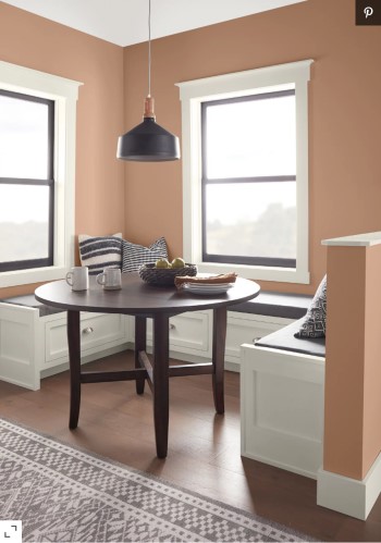
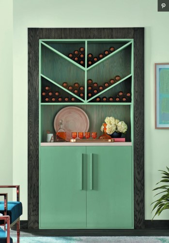
Better Homes and Gardens published an article on “Every 2021 Color of the Year We Know So Far,” which included these two photos of Canyon Dusk by Behr and Vintage Blue by Minwax:
A sample of these two colors shows RBG values of 170,131,105 for Canyon Dusk and 107, 164, 131 for Vintage Blue.
To create a palette of golden ratio-based colors from these two base colors, we enter them into the PhiMatrix color palette generator and click on the Update button. The Color Palette Generator window and then looks like this:
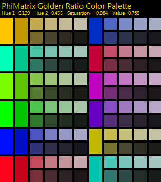
The color palette window is as follows:
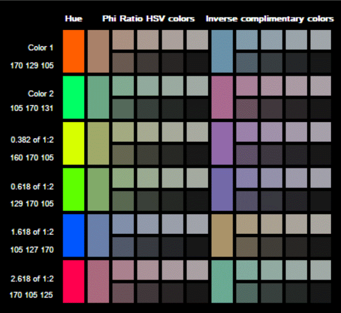
Note that the very first column represents the two base colors and successive golden ratio based variations, but with the Saturation and Value adjustments set to a full 1.000.
The second column shows the actual base colors selected. So Canyon Dusk is in row 1, column 2 and Vintage Blue is in row 2, column 2.
The two colors that are at the golden ratio points of Canyon Dusk and Vintage Blue are in column 2, rows 3 and 4. It shows two colors because a golden ratio can be calculated from left to right or right to left on the spectrum. So those two colors of RGB 160, 170, 105 and RGB 129, 170, 105 are the golden ratios between Canyon Dusk and Vintage Blue.
Other golden ratio variations on the base colors are shown in column 2 rows 5 and 6, with RGB 105, 127, 170 and 170, 102, 125. So ALL of these colors are in golden ratio relationship to one another, and any can be used to create a golden ratio-based palette.
Color palettes often use inverse colors as complementary colors, so the colors in column 7 are the inverse colors of the colors in column 2. That provides more yet colors that can be used in the same palette.
Color palettes also often use different shades or grades of a color. That’s what columns 3-6 and 8-11 provide. Each is a slightly different shade that is based on adjusting the Saturation and Hue by the golden ratio of the base color.
There are really no rules or limits on how these colors can be combined. That’s where artistry and creative license steps in. Here’s just one five-color sample chosen from different colors on the palette:
