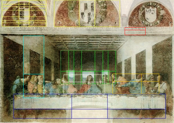
If Leonardo Da Vinci had a laptop, PhiMatrix might have been his favorite app. See all the golden ratios that appear in “The Last Supper,” both in key features of the room as well as positioning of Jesus and the Disciples in the composition of this great work of art.
The Golden Ratio vs. the Rule of Thirds
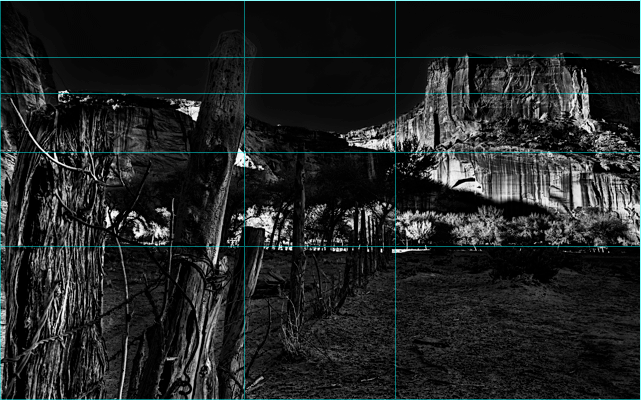
Artists have long used a “Rule of Thirds” as a guide to composition. This rule, however, is just a rough approximation of the golden ratio proportions that appear in nature, and that has so many unique mathematical and geometrical properties.
The Rule of Thirds creates divisions at 33.3% and 66.7%. The Golden Ratio creates divisions at 38.2% and 61.8%. This might seem like a small difference, and in some cases the Rule of Thirds will not be notably different to the eye.
Tom Ang, a professional photographer, explains the impact of this difference:
“Phi is a lot more interesting because it can be used to generate structures which are intuitively and innately harmonious, or look simply natural and ‘right’. With Phi you can sub-divide an image in many different ways e.g. each half divides into Phi ratio, and each portion can be sub-divided according to Phi ratios. The amazing and wonderful thing is that when you apply these sub-divisions to natural forms as diverse as butterfly wings, animal faces and human faces, you’ll find major features are mapped to the main Phi divisions, which suggests Phi is based on fundamental ways in which structures are generated. This is a far cry from the the simplistic Rule of Thirds. I always say that if you want your pictures to look the same as everyone else’s, follow the same rules as they do.”
Tom Ang, Photographer, author, and leading authority on digital photography (New Zealand)
www.tomang.com on The Golden Ratio and the Rule of Thirds
Composition as unique as you, but in harmony with the aesthetics of nature
With its dozens of composition templates, PhiMatrix allows artists to truly integrate the Golden Ratio in their compositions beyond using a simplistic “Rule of Thirds” to place a horizon line or position a key focal point. As illustrated in the “Beauty” video in the right side bar, a single human face can have over twenty of these “divine proportions,”, ratios nested with ratios, that work together to produce harmony of proportion.
What would your creative instincts produce if the same design concepts were applied to your next work of art?
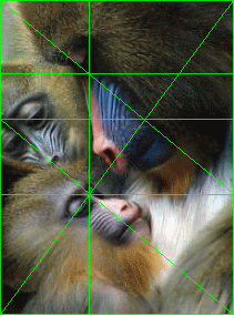
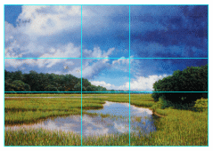
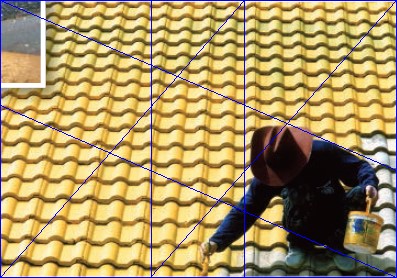
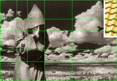
Equally applicable to paintings, graphic arts and photography, below are just a few examples of composition techniques that apply this proportion from the many design templates of PhiMatrix:
