The following is an illustration of how a logo can be redesigned using the golden ratio.
CreateTrade came to us with this existing logo:

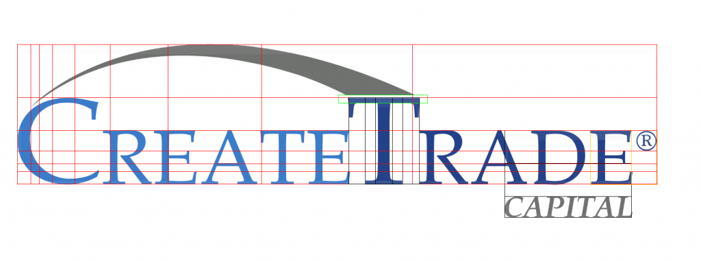
I modified the logo so that a variety of its proportions and dimensions were based on the golden ratio, as shown by the grid lines:

The key changes included:
- Position the swooping arc to end at the golden ratio point of the length.
- Resize the large letters to be golden ratios of the total height of the letters and the arc.
- Resize the small letters to be golden ratios of the large letters. Note that the font already had crossbars of the A’s at the golden ratio of their heights.
- Resize the gap between the T and the arc to be a golden ratio of the distance from the bottom of the T’s crossbar to the bottom of the arc.
- Resize the seriphs on the E’s to be golden ratios of their heights.
- Resize the Registered symbol to be a golden ratio of the height of the small letters.
- Resize the word Capital to be a golden ratio of the height of the small letters.
- Resize the space between Capital and the bottom of CreateTrade to be a golden ratio of the height of the small letters.
Before the changes, all the dimensions mentioned above were inconsistent in their application.
The results are subtle, but create a consistent proportion and spacing throughout all aspects of the logo. This gives it a more balanced, professional and aesthetically pleasing appearance.

The changes are perhaps best appreciated in an animation that shows the transition from the before to the after:

Its crazy how such simple little things will grab peoples attention or they will just glaze over them. Using the Golden Ratio attracts peooples eyes and it makes an imprint on there brain it really does make a big difference.