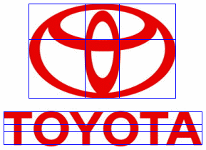
From Renaissance artists of the 1500’s to graphic artists of today, phi is recognized for its ability to give a sense of aesthetic appeal in balance and harmony of design. Product logos represent an image that must make a positive and memorable impact on the conscious and subconscious minds of consumers, so it is no surprise to find phi proportions in many logos of major companies. The Phi grid proportions are provided by PhiMatrix software by simply overlaying the PhiMatrix grid to unveil the design proportions inherent in these well-designed and very recognizable logos.
No limit to creativity in design opportunities
Note how the following logos of these internationally recognized companies all use the golden ratio to achieve a professional, aesthetically pleasing proportions of design:


Note how every dimensions of each letter of this logo is apparently based on proportions of the first and second phi lines, which are golden ratios of one another:

Note how the crossbar of the Nissan logo is defined by these same golden proportions:

Like Toyota, even the letters of the word Nissan are defined by golden proportions, as illustrated by the horizontals of the S and A:

The Honda logo takes a different approach in its application of this design concept. Two golden rectangles in portrait orientation form the dimensions of the logo. The key positions of the H still align to golden ratio points.
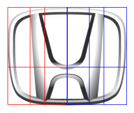
The logos of many other internationally recognized companies use golden ratios, embracing the design proportions found in nature that appear most aesthetically pleasing to the human eye.



The amazing result is that while all these logos use the golden ratio in their design, all are completely unique and different.
Pepsi’s ad agency did the redesign of the Pepsi logo above by applying concepts of Phi and the construction of the Golden Section. Read it in a 4MB PDF HERE.

