The Golden Ratio recently swept the awards in an international photo contest.
 When you see an attractive face or body your mind is subconsciously recognizing the golden ratio proportions that appear throughout the human form and nature. Our minds are wired to perceive this proportion as natural, balanced, beautiful and aesthetically pleasing. It should be no surprise then that the most appealing creative works in all forms of art and design would also embody the golden ratio, and its use can be as unique as each individual’s face and diverse as nature.
Watch the video in the right side bar or look at the award-winning photographs below from Costco’s 2010 International Photo Contest (download article) to see the impact of the golden ratio in creating the best of the best. Each photo below shows an overlay of a different PhiMatrix grid using Golden Ratio proportions in every line. Click on the YouTube video in the right side bar to see how it was done.
Tutu, too by Neal Moran
International Grand Prize Winner
Source of photos on this page: Costco Connection, February 2011, Volume 26, Number 2, Page 30
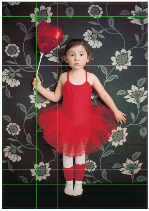
Just as a beautiful human face is based on Phi proportions in many dimensions, this Grand Prize winning photo does the same.
Phi in the Framing (Below) – For overall framing, the photo on the left shows alignment on vertical lines of the width of the tutu and girls body with 1st and 2nd Phi lines of the width of the photo. The alignment on horizontal lines places key elements at Phi lines of the height of the photo as well, including the balloon, the head, the base of the wall at the floor and the red and white white tights and shoes.
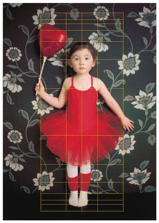
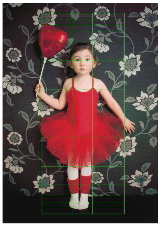
Phi in the Subject (Middle and Right Photos) – The girl herself also embodies many Phi proportions. On vertical lines, the middle photo in PhiMatrix Center mode shows the Phi proportion of the width of the girl’s body to her tutu. The right photo in PhiMatrix Left&Right mode shows that even the straps of her tutu and width of her face are in perfect Phi proportions to the width of the tutu. On the horizontal lines, the PhiMatrix Top&Bottom mode on the middle and right photos shows the alignment with Phi lines of the balloon, eyes, top of the tutu at the straps, the bottom of the tutu and the base of the wall.
Whether the photographer planned all the golden proportion elements of the photo or just had an incredible eye and a fortunate moment, the end result captivates the human mind in its perception of balance, beauty and aesthetic appeal.
See other winners below. The photos all capture some winning element of human interest, design or color, and all use Phi, the Golden Ratio, in their composition.
Yelena Moore – Honorable Mention: This unique approach to composition relies not on horizontal or vertical lines but instead divides the photo diagonally to create a visually engaging perspective of a simple subject.The key defining line is the right edge of the door, which is a diagonal from the phi point of the top border to the bottom right corner. Note that the left edge of the door starts at the phi point on the left side and cuts diagonally to close to the phi point at the bottom.
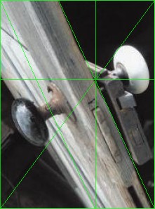
H Lines – 1, V Lines – 1, H Axis – Bottom, V Axis – Left Diagonal – 618a, H Width – 221, V Axis – 298
Jean-Yves Ferrault – 1st Place: The illuminated Buddha sits between the 1st and 3rd horizontal Phi lines of the photo, with the head to body in Phi proportion as well as defined by the 2nd horizontal Phi line..The photo is cut in half by a center line with the illuminated Buddha sitting inside the 1st Phi line from the center to the right side.
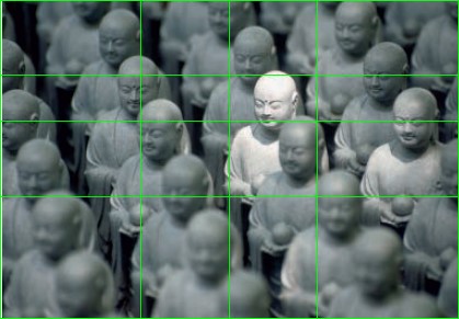
H Lines – 3, V Lines – 1, H Axis – Top, V Axis – Center, H Width – 419, V Height – 291
Rex Steyskal – Honorable Mention: The eyes of the three baboons fall at the 1st, 2nd and 3rd horizontal Phi lines.The eyes of the top and bottom baboons fall at the 1st vertical Phi line.The faces of all three baboons are aligned on diagonal Phi lines from the corner to the opposite 1st Phi line.
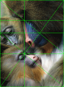
H Lines – 3, V Lines – 2, H Axis – Top, V Axis – Left, Diagonal – 618c, H Width – 212, V Height – 284
Class Act by Nick Stentzel – 1st Place: The bottom of the chalkboard is at the 1st upper horizontal Phi line. The shoulders of the girl at the board, the boys in the first row and the boy in the back row are all at horizontal Phi lines from the top and bottom.The girl’s left shoulder and dress are aligned with the first vertical Phi line to the left of the center.
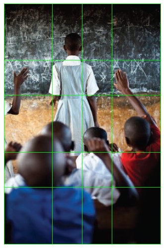
H Lines – 3, V Lines – 1, H Axis – Top&Bottom, V Axis – Center, H Width – 316, V Axis – 483
Andrew Todd, United Kingdom – 1st Place: The man is positioned to fill the section to the right of the vertical Phi line.The angle of the man’s back follows a diagonal Phi lines from the corners to the Phi point on the right side.
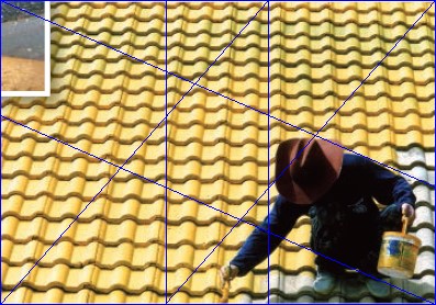
H Lines – 0, V Lines – 2, H Axis – None, V Axis – Left, H Width – 397, V Axis – 278, Diagonal – Corner-618b
A Dog’s Tale by Kim Crisler – 3rd Place: The door itself has Phi proportions with the window being at perfect 2nd Phi lines from the outside of the door frame.From the top to bottom of the photo, the composition places the bottom of the window and the bottom of the dog’s feet at the Phi lines from the center of the photo.In addition, the line where the door meets the floor is at a perfect Phi line from the top to bottom of the photo, as indicated by the horizontal red Phi line.
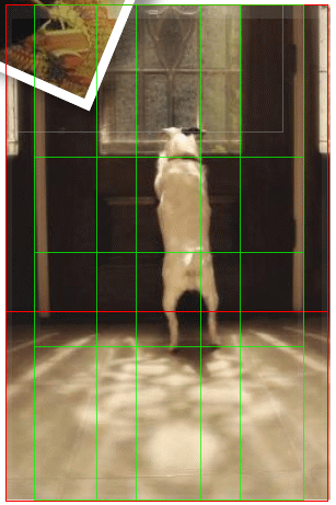
H Lines – 1, V Lines – 3, H Axis – Center, V Axis – Left&Right, H Width – 252, V Height – 453
Jinhee Lee – 1st Place International: With the vertical lines, the photo is cut in half with a center line and the girls head/body and outside of the arms align to the 1st and 2nd Phi lines from the center.With the horizontal lines, the girl’s head, hair line, eyes, shoulders, bottom of shirt sleeves, waist line, bottom of shirt and tips of fingers are all aligned to Phi lines from the top and bottom of the photo.
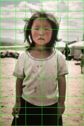
H Lines – 5, V Lines – 2, H Axis – Top&Bottom, V Axis – Center, H Width – 289, V Axis – 433
Mateos Ortez, Mexico – Honorable Mention: The Monk is positioned at the 1st and 3rd vertical Phi lines from the left.The horizon and key elements of the elbows, hands and top of back at the hood are all at horizontal Phi lines.
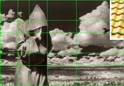
H Lines – 3, V Lines – 4, H Axis – Top&Bottom, V Axis – Left, H Width – 406, V Axis – 282
Steven Riffel, Canada – Honorable Mention: Vertical Phi lines from the center define the position of the surfer and both hands.The horizontal line of the right arm is aligned with the 1st horizontal Phi line from the top of the photo to the bottom..
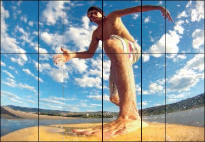
H Lines – 1, V Lines – 2, H Axis – Bottom, V Axis – Center, H Width – 405, V Axis – 281
Jayme Schlais, Washington – Honorable Mention: The carnival ride itself, the focal point of the photo, has Golden Ratio proportions with the height of its tower at a horizontal Phi line of its height and its width at vertical Phi lines of the wing’s width.
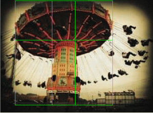
H Lines – 1, V Lines – 2, H Axis – Bottom, V Axis – Left, H Width – 191, V Axis – 205
Bedtime Stories by Quynh Nguyen, California – 2nd Place: The vertical Phi line from the left defines the position of the face at the tip of the nose.With the horizontal lines, the bottom of the face is positioned at a Center line. The 2nd Phi lines from the Center line then align with the line of the pillow on top and the arm on the bottom. The 1st Phi line on top of the Center line aligns with the eyes, a key focal point.
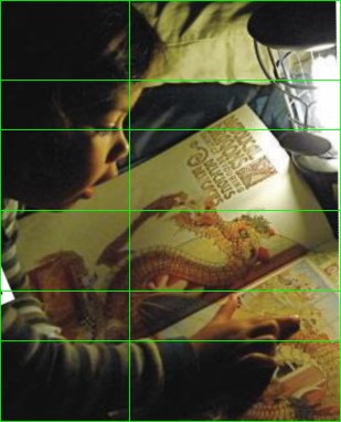
H Lines – 2, V Lines – 1, H Axis – Center, V Axis – Right, H Width – 309, V Axis – 382
See illustrations on how to use PhiMatrix for cropping and matting of photos, as well as for design applications.
“Golden Ratio sweeps awards at international photo contest” was
in fact a pretty good blog, . Keep composing and I will continue viewing!
Thanks a lot -Jacklyn