Phi is also used to achieve excellence in the aesthetics of product design, and in more places than you might imagine.
Consumer product applications
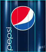
One PhiMatrix user works for a company that designs plastic bottles for the soft drink industry. Note how the indents to the narrow section of the bottle are at golden ratio points:

The Pepsi logo within the label is at the second phi line of the PhiMatrix basic grid as well, using nested golden ratios ratios to assure harmony in design:
Another PhiMatrix user who works for Timberline revealed that the design of their best selling boot also sports this same golden proportion:

User Interface applications
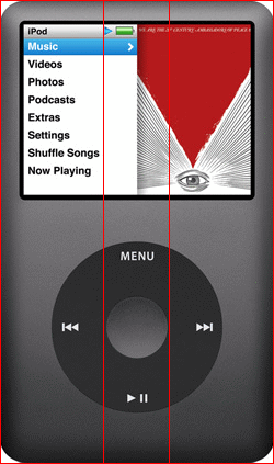
Apple is known to use the golden ratio, from the width of the button on the iPod classic to its new iOS 7 icon design template :
In the template to the right, the PhiMatrix rectangle template in red and circle template in yellow highlight the golden ratios in the iOS 7 icon template:
![]()
Auto industry applications
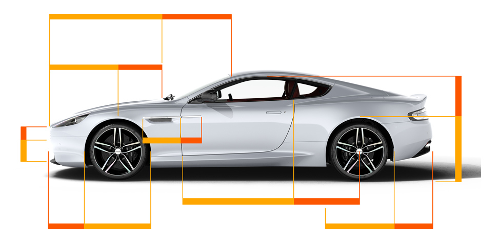
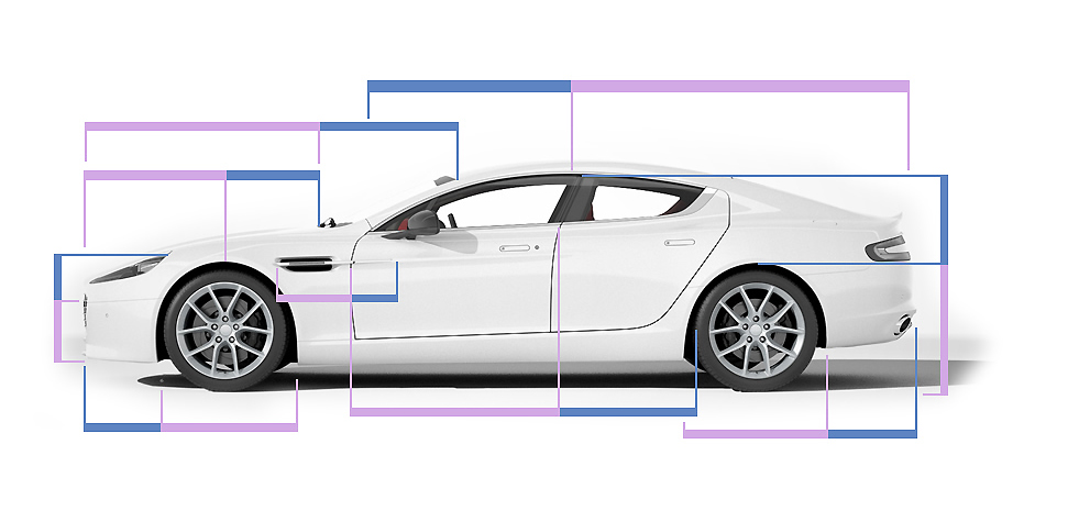
Aston Martin boldly proclaimed the golden ratio as the basis for its redesigned DB9 and Rapide S models:
 Golden proportions can also be seen in this Lexus:

Where function and form unite
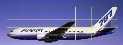
This one is a mystery. Jet aircraft are undoubtedly designed first for functionality and aerodynamic qualities rather than pure beauty. So even if they’re not designed purely for aesthetics, it still seems that golden ratio proportions appear in the fuselage and wing to tail proportions of the 767. Phi seems to appear just about everywhere and still looks good.
PhiMatrix has dozens of unique design templates to help you produce great looking results in whatever you design. With the Golden Ratio as your secret weapon, what can you design next to apply these principles?
